Wow....I am speechless of how uglier and uglier the MH livery becomes. I really adore the old one with the cheatline. I thought the current (new) one is ugly but at least the Wau still looks good with the red colour mixed in.
Without the swoosh, this new(er) one with 1 single colour of blue now reminds me of the new FINNAIR livery which of course is very ugly. With the swossh, this new(er) livery reminds me of nothing but a very ugly livery where everything seems to be misplaced.
What has happened to the creative team that comes up with the special "Heliconia" livery?
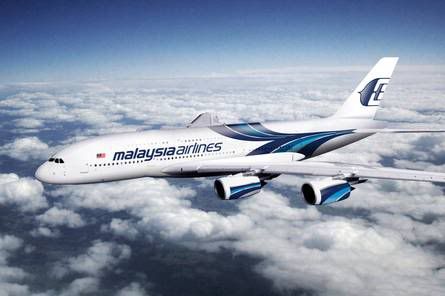
Missing a dash of red. Not the nicest of liveries on the 380's but definitely better than the 'Golden Goose' one.
I disagree about this being better on the A380 than the one applied by the Golden Goose...The Golden Goose one is at least clean and has withstood time. This is just very messy. The colors on the engines also look messy and misplaced. Something is also not right with the way the swoosh ends or starts (depend on how you look at it) from the tail fin. I actually think that the current (not new) cheat line version will look quite nice on the A380.
Agree that the interior at least has a decent colour scheme - although the seat is about half a generation behind. At least it does look like it goes fully flat.
 Tweet
Tweet


")

")
Comment